ROY LICHTENSTEIN (1923-1997)
‘The cliché gave my work a certain power. It was brave, risky. I try to organize its forms to make it monumental. The difference is often not great, but it is crucial.’ Lichtenstein, a New Yorker born to a wealthy family, blurred the distinction between commercial art and fine art. With Andy Warhol, Claes Oldenburg and Jasper Johns he became a leading figure in the Pop Art movement. Although initially trained by an American realist who spurned French modernism, he rejected the anti-European bias when serving in France in WW2 and encountering the work of Picasso, Braque and Léger. Léger’s industrial themes, his use of tubular, conical forms and primary colours, were pivotal in Roy’s later development. He was also impressed by Bill Maudlin’s cartoons in Stars and Stripes, the army newspaper, and enlarged them, an early indication of his 1960s process.
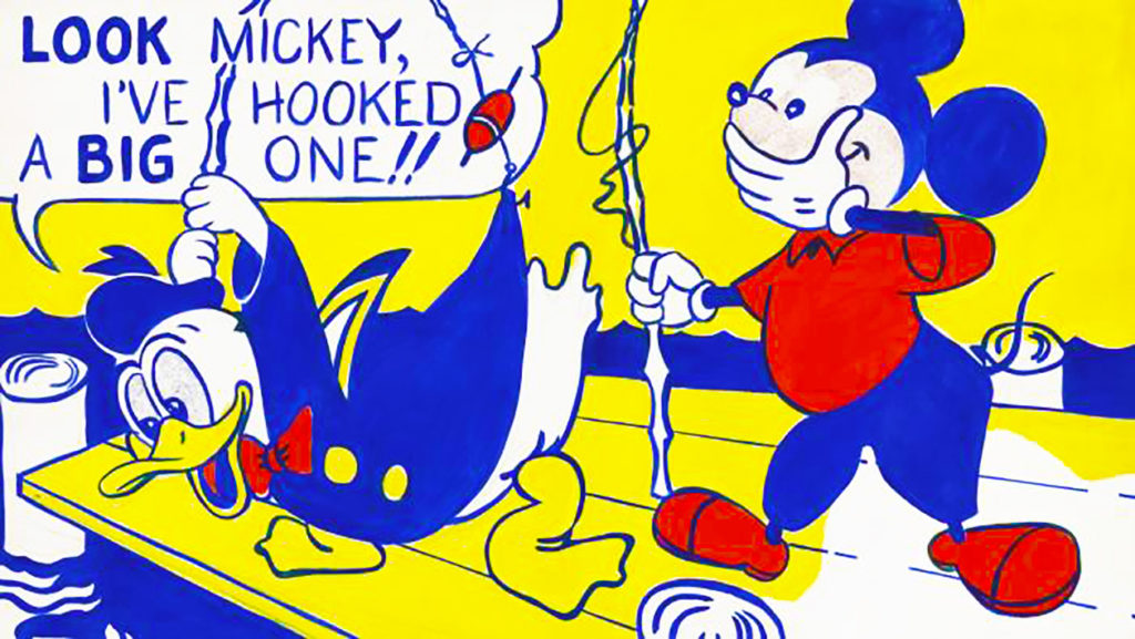
LOOK MICKEY
 After the war, and after a degree in Fine Arts at Ohio State University, he moved back to New York where he took various teaching posts but struggled to establish a style, flirting (unsuccessfully) with abstract expressionism and becoming increasingly despondent (he was married with two young boys). Then in 1961, he chanced upon a picture in one of his son’s books – one of the Little Golden Books series. It showed Donald Duck and Mickey Mouse fishing. His boy said – ‘I bet you can›t paint as good as that.’ He blew it up, drawing the outline directly onto a huge canvas and painting in oil. What triggered the innovative approach of Look Mickey? ‘Desperation,’ said Lichtenstein – but also his mentor, the American painter Allan Kaprow, who taught with him at Rutgers University, NJ. Kaprow had shown his friend a Bazooka Dubble Bubble Gum wrapper: ‘You can›t teach colour from Cézanne, you can only teach it from something like this.’
SPEECH BALLOONS, COMIC BOOKS AND BEN-DAY DOTS
Look Mickey is the first example of Lichtenstein’s use of speech balloons, comic book imagery and Ben-Day dots (‘typewriter pointillism’ one critic called it) – the mechanical technique for printing comics. He was also inspired by mail-order catalogues and newspaper ads, classic bourgeois Americana – as in Girl with Ball (1961), culled from a New York Times resort ad. It is typical: a vivid close-up compressed into a jigsaw of flat shapes, a nod to Mondrian and Japanese prints. It is about post-war optimism, naivety. 1961 also saw him financially secure after the Leo Castelli Gallery paid him a nice stipend (despite Castelli exclaiming ‘He just can’t do this!’ when first seeing his work). He explored new avenues. Influenced by Warhol he began in 1962 a series isolating consumer products against empty backgrounds – Portable Radio, Tire, Sock – lampooning their status as modern monuments, but respecting the power and immediacy of the original design. Thereafter he increasingly found source material in DC Comics.
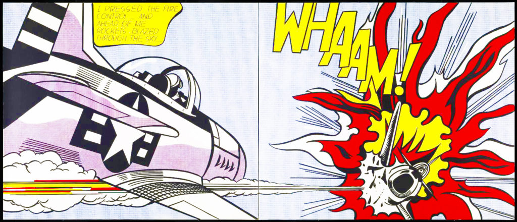
WHAAM!

His most successful themes are love, war – guns blasting their target, as in Whaam! (1963) – and girls in the pangs of teenage angst: girls crying, kissing… the banality of the image elevated to mantlepiece art. He referred to the ubiquitous text balloon as a ‘kind of Pop poetry’.
His fame grew in the 60s and 70s. To accusations of plagiarism he countered: ‘I am nominally copying, but I am really restating the copied thing…’ For all his satirical bent, he revered industrial art, the people’s art. ‘The things that I have apparently parodied I actually admire.’ Whaam! has been praised for its ‘epic vein’, ‘art nouveau elegance’, ‘Baroque extravagance’. Lichtenstein was less pretentious. He acknowledged a debt to the Tintin books. He considered Picasso ‘the greatest figure of the 20th century’, not least for his ‘lack of pomposity’, a quality that shines through Roy’s work. ‘I never thought my art or pop art would last more than six months’ he said; but by transferring the humblest small ad or comic onto canvas, with all the strength and wit of Picasso, he transformed the banality of commercial art – and ensured that the art of Roy Lichtenstein will endure.


